We are familiar with the classic composition technique, The Rule of Thirds. It is something we all learn when we are starting out street photography, and it was a quick way to generate a pleasing image.
… but it has one major problem that is preventing your photos from going from good to great.

A photograph loosely using The Rule of Thirds
And that is, it is boring.
What Makes The Rule of Thirds So Boring?
There are two main reasons that The Rule of Thirds generates boring street photographs.
No Relationship to the Scene
The first is that the rule does not account for the subject’s relationship to the rest of the scene. It is more focused on the subject’s placement as it relates to the frame. With the Rule of Thirds we are placing the focal point of our image at the intersection of two lines that divide the frame into thirds both horizontally and vertically. Therefore, we can take some fairly bland photos that “follow” this rule to a T.

The green lines show the rule of thirds
Take a look at the photo above of the woman holding a phone. I have her hand framed perfectly in the lower left using The Rule of Thirds, but it does not make an effective photograph.
The photograph shows very little in terms of the relationship between the subject and the background. This was shot in Chinatown, Philadelphia, which is hard to tell from the photograph. Had I been more attentive, I could have had the woman passing some Chinese signs, added some interesting passers-by in the frame, or at the very least avoided having a car occupy 50% of the scene.
It is Ubiquitous
The second reason The Rule of Thirds creates boring street photographs is that it is ubiquitous. It is everywhere. From family portraits to magazine covers, people use The Rule of Thirds all the time, which makes it a very predictable and unexciting visual framework.
Just do a quick Google search for The Rule of Thirds and you will see a lot of photographs that are largely forgettable. Although you haven’t seen these photographs before, they are very similar to a lot you have already seen.
So what is the solution? Well I would argue it should be a new more dynamic Rule of Thirds, what I am calling The 3 Point Rule.
The New Rule of Thirds = The 3 Point Rule
The 3 Point is Rule is pretty simple in theory, but it can take months, even years to master and not every scene is perfectly suited to it. Like all compositional aids, it is merely that, just an aid. You can use it as is, blend its concepts with other aids, or ignore it completely and still create amazing photographs.
However, I find this to be one of the most flexible aids and one that I like working with the most because it offers a lot of options.
The 3 Point Rule
Include 3 or more separate points of interest that relate to one another or build to a larger narrative within the composition.
A point of interest can be something as simple as a person, an item, a cluster of action, or really anything that catches your eye. The key to making this technique work is that each “point” has to somehow build on the others or relate to the others. Also, each point must be discrete and avoid overlaps with other points, otherwise the effect of the technique will be reduced.
Why 3? Why Not 2? Or 7?
This is a great question! Why do we need 3 points of interest? Well, with 2 points of interest, I find the composition to be lacking in direction. The eye will ping-pong between the two points and not really explore the scene.
Take a look at this example, what does your eye do when you first glance at it. It navigates to the guy in the hat, then the guy on the bike. Then, if you are curious, you can explore the remainder of the scene. It does not naturally guide your eye around the frame like a 3 point composition would.

An example of what happens if you only have 2 points of interest
What would happen if you added 7 points of interest? Then the scene may appear too crowded or cluttered, like in this example below. The effect of this technique does not really work here, because the scene has so much going on that there are no defined clusters of action.

An example of what happens when you have too many points of interest
That is why we use 3 points of interest. You can get away with 4 or even 5, but the more you add, the harder the composition becomes to balance. At that point, you will have to start thinking about making the print larger or really positioning yourself to ensure no overlaps between points.
So, how can we use this rule successfully? Fortunately, the 3 Point Rule works well with some already existing frameworks.
Foreground, Midground, and Background Layering
The first way I like to think about this is as a simple foreground, midground, and background scene. Your goal in this configuration is to have an interesting “point” at each of those locations in the frame to pull the eye from front to back. You can think of this like using The 3 Point Rule as a cheat code to creating layers like Alex Webb or Yash Sheth.
For example, in this photo, we have the mother gesturing at her child in the foreground of the frame. In the midground, there is a kid running through the mist. Then in the background, we have other families and kids playing in the water.

This works with The 3 Point Rule because they all relate via this feeling of youth and family to create a cohesive image. If these were all disjointed subjects, the image would not be as strong and would merely be a pleasant arrangement of figures.
This is an example of The 3 Point Rule that uses more than 3 points. Here we have 4 points, and it works because none of them awkwardly overlap. Also, when using Layering it can be easier to include more points because the scene has added depth which adds separation.
Leading Lines
This is a fun way to apply this principle. Rather than using Leading Lines as an element in your scene to draw your viewers into the subject, the line is made up of subjects! Let me explain…
To do this, when composing your scene look for scenes where subjects are arranged into a line going in any direction, assuming it does not cover up or heavily overlap subjects. I would say lines that go from foreground to background are strongest because it adds depth, but horizontal or diagonal lines work as well.
Let’s take a look at this example of 3 girls sitting on a bench. They form a perfect diagonal line moving across the frame.

The bench curving towards the corner of the frame helps support this “Leading Lines” effect.
Furthermore, this shot matches the second requirement of The 3 Point Rule very well; the points must relate or build on each other. Here they relate because all three girls are about the same age, wearing similar colored clothes and are sporting a similar hairstyle. This creates a cohesive image that is much stronger than if 3 strangers wearing different clothes were sitting on the same bench.
Shapes
And the last way to think about this through shape. This is one of the most powerful but also hardest to visualize methods. Think about your points of interest as points of a polygon. You can arrange your subjects into triangles, quadrangles, or even hexagons.
When you utilize shapes, the viewer eye will naturally scan the corners of the shape and will inadvertently force them to view the whole scene. This can be hard to think about when looking through your viewfinder, so I think it is best to still just think about “points” and naturally this composition will evolve.
In this photo, there is a triangular relationship between the main subject and the two secondary centers of action.

There are 3 points of action that draw you into the scene. You have the main subject who has a bewildering expression. Then your eye moves to the guy with the bike chatting with the cop. And finally you see the two folks sitting at the table chatting. By that point, the viewer’s eye has scanned the majority of the scene.
What could improve this photograph would be if the subjects had a more direct relationship with each other. For example, if the bicycle theme ran throughout all the points of interest, then it would be a stronger image. However, you don’t always get that lucky and have to learn to work with what you have.
A Note on Lens Selection
This technique relies on having a lot of things included in the scene and in relatively good focus. This means a wide angle lens will help out a ton here. I prefer 28mm or 35mm for a few reasons:
- Angle of View: These lenses take in a lot of the scene, which I find super helpful when trying to squeeze in the 3rd or 4th point into a composition.
- Low Distortion: These lenses tend to have lower distortion, despite taking in a wider field of view. I have also had success using a 12mm fish-eye with this technique, but you have to be fully prepared for the lens distortion and to get within inches of your subject.
- Depth of Field: When you use a wider angle lens, the amount of the image that is in focus around your critical focus point increases. All this to say, that there is less bokeh and more in-focus. Which, for this technique, I think helps make the image pop.
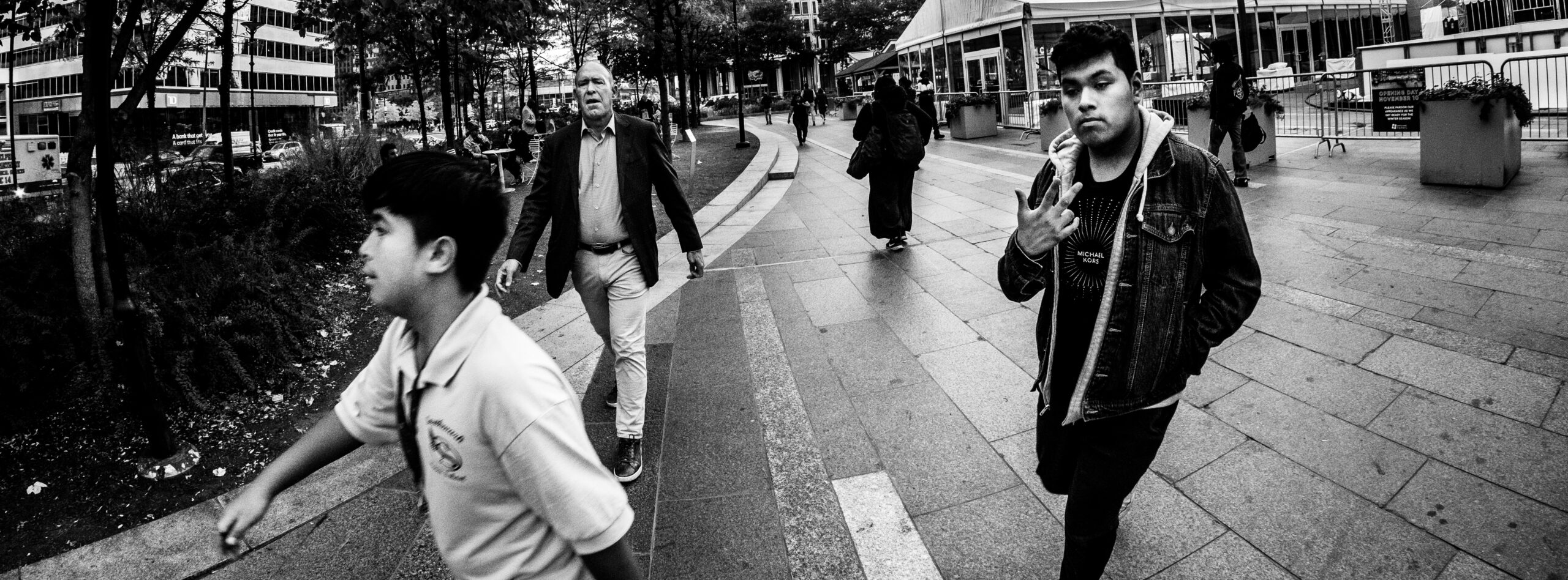
An example of The 3 Point Rule while using a 12mm fish-eye lens.
However, as usually, there are no rules! You can try this with a 50mm or a 85mm and experiment with shallow depth of field. It is all about experimentation and developing your own preferences.
When to Use the 3 Point Rule
The 3 Point Rule is just another visual aid, like the Rule of Thirds, Layering, or Leading Lines. It is just a way of thinking that I have found works really well for me on the street. I don’t really see scenes as easily as I do see subjects and relationships, therefore creating The 3 Point Rule allows me to generate scenes by stringing together subjects.
I tend to use The 3 Point Rule when I am photographing in places that aren’t streets because there is room for layers. It is also super useful during festivals because there are typically multiple points of interest within close proximity to one another. I think it is really best suited to medium to high traffic locations. With low traffic locations, the lack of subjects can make it more challenging to align 3 or more points into a scene.
There is no one-size fits all, it is all an experimental and deeply personal process. I can only tell you what works for me and encourage you to try the concept out. Heck you might try it and hate it or find a way to expand the concept even further. Let me know in the comments what you think of this method.
Homework
As usual with our lessons, there is homework included! This is a harder compositional skill to learn, so I am going to say that you should spend the next 2 to 3 weeks trying it when you are out taking pictures.
Take the following images using The 3 Point Rule:
- Utilize the Foreground, Midground, and Background composition
- Utilize the Leading Lines Composition
- Utilize the Shapes composition
Don’t just take 3 of these and be done. To really get the technique down, I would try to take as many frames as possible and experiment with these concepts. Get a feel for how you want to apply them, not just how I like doing things.
Once you have your 3 images, post them to our image critique thread on Flickr and I or a member of our Flickr group will give you feedback on your images.
Looking Ahead
The 3 Point Rule is just one of may compositional frameworks available to us as street photographers. Keep on the lookout for more articles around composition. If you have any specific skills you would like me to cover, please let me know in the comments.